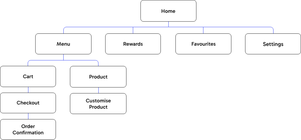
Home
Menu
Product
Customise Product
Cart
Order Confirmation
Home
Menu
Product
Customise Product
Cart
Order Confirmation


As part of my assessment for Google’s UX Design Professional Certificate, I was required to build wireframes and create a prototype for a mobile app. The brief was to design an app for a food truck based in New York City, delivering solutions that address users’ needs.
Tasked with an open brief that has a wide range of possible outcomes; I decided to narrow the scope. I determined that the primary function of my app would be that customers can schedule their orders ahead of time and collect them from the food truck at their convenience. This required me to at least create a menu of products, a checkout function, and a payment screen.
UX/UI Design
Branding
Strategy
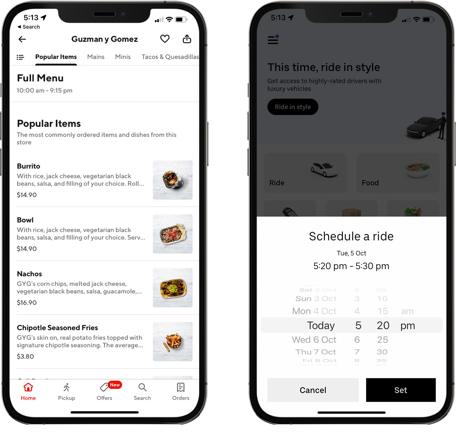
As part of my competitor analysis and design research, I looked at other apps within the fast-food space, such as McDonald’s, Uber Eats, DoorDash, and Domino’s. I also analysed ridesharing apps such as Uber, Didi and Lyft to see how they handle the logistics of user’s scheduling orders in advance to ensure a seamless experience.
DoorDash and Uber
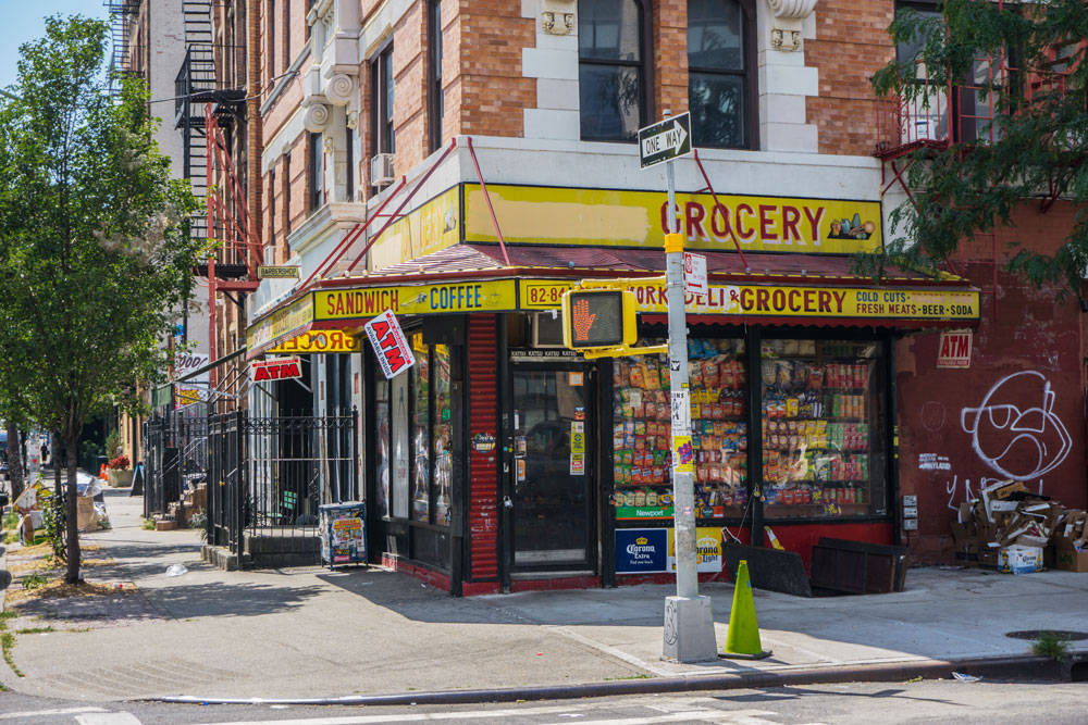
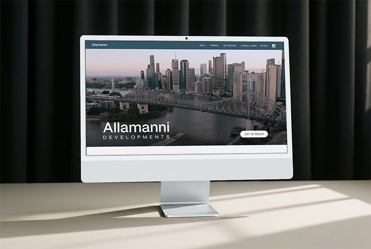
Typical bodega shopfront – Brooklyn, NYC
The architecture of Bodega is built on a shallow hierarchy to facilitate rapid task completion. By prioritising a linear path from the menu to order confirmation, I reduced the number of touchpoints required for a user to schedule a pickup. This structure ensures that product customisation is nested logically within the selection process, preventing unnecessary navigation loops and keeping the user focused on the primary conversion goal.
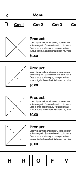
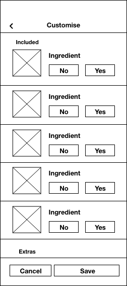
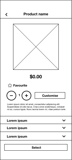
These low-fidelity wireframes establish a clear visual hierarchy that prioritises core user actions and essential product details. The layout ensures scheduling and checkout functions remain prominent, using strategic whitespace to create a scanable experience. This foundational structure allows for intuitive navigation and customisation, ensuring the app remains functional before any aesthetic layers are applied.
In addition to designing the layout and functionality of the app, I created an identity for the fictitious food truck. I have a personal preference for Mexican food, so I decided early on that my food truck was going to serve Mexican cuisine. For the colour scheme and design elements, I drew inspiration from the colourful shopfronts of bodegas in New York City.
The finished designs transform the initial wireframes into a cohesive and accessible mobile experience. I prioritised a clean interface that highlights product photography while using strategic colour application to guide user decision-making. This final iteration validates the information architecture by providing a seamless, branded path from initial food discovery to the final order confirmation and pick-up.
The home screen layout is arranged hierarchically based on common user pathways.
The most common user pathway from the Home screen is to the Food Menu screen. To help facilitate this progression, there are 3 ways to navigate to the Food Menu from the Home screen.
1. Tapping the “Order Now” banner
2. Selecting a food category from the Food menu slider.
3. Tapping the order button on the Menu bar.
Each item in the menu has a product photo, description, and price. This allows comparisons between menu items to be made easily without the user having to navigate to each individual product screen.
Product categories can be navigated to by simply swiping up through the products, or by tapping the menu of categories at the top of the screen.
From the product screen users can choose to customise a product by adding or removing toppings and ingredients.
The colour of the buttons are informed by colour theory. Green for yes, red for no. This helps remove any ambiguity for the user about whether an option is selected or not.
Once a product is selected, but before it is added to the cart, the user is given a choice of how spicy they want their food. To highlight what is a key specification for most users, I added this option here rather than on the ‘Customise’ screen.
As most users purchase a drink with their food, it is at this stage they are given the option to also add a drink to their order. This saves the user having to navigate back to the menu unnecessarily.
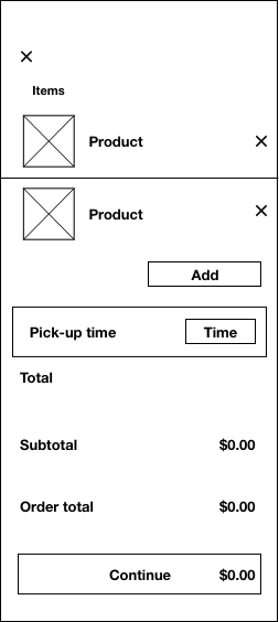
Once products are added to the cart, users can then begin the checkout process.
The cart shows an itemised list of the products selected, along with quantities, customisations, and prices.
Part of the checkout process is nominating a pick-up time. The pick-up time is set to ‘Now’ by default but can be scheduled for any time up to 24 hours in advance.
It is at this point that users can also add a promotional code if they have one.
Tapping ‘continue’ takes the user to the payment screen. Here they can review pick-up details, see an order summary, and select their preferred payment method from the options available. This example shows payment using Apple Pay.
Once payment has been processed and approved, the order is then sent to Bodega. While the order is being sent, there is an animated loading screen updating the user of the progress.
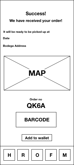
If the order is successful the user is taken to an order confirmation screen where confetti provides visual feedback.
Finally, the user is provided with an order number that can be added to their phone’s wallet for use when collecting from the food truck.
I’m always open to collaborating on projects or exploring new opportunities.
Feel free to drop me a line here via the contact form and I’ll get back to you as soon as possible.