Ares Technology is a Queensland-based deep-tech energy company pioneering a new class of zero-emission energy systems, designed to capture and harness entropy already present in the environment and the human body. Their EntroClass platform spans three domains: human performance wearables, smart infrastructure, and energy storage, with the goal of embedding continuous, sovereign power into people, buildings, and cities.
I led the design of the Ares Technology website to communicate a bold and emerging technology to early partners, investors, and collaborators. The project focused on translating complex innovation into clear, compelling storytelling, while building visual credibility for a company at the frontier of energy independence.
Role
UX/UI Design
Digital Design
Why was a redesign needed?
As Ares Technology prepares to bring its EntroClass platform to market, their existing website no longer reflected the ambition or credibility of the company. With funding and key collaborations on the horizon, they needed a polished, design-led presence that could open doors, build trust, and position Ares as a serious player in the future of zero-emission energy.
The Redesign
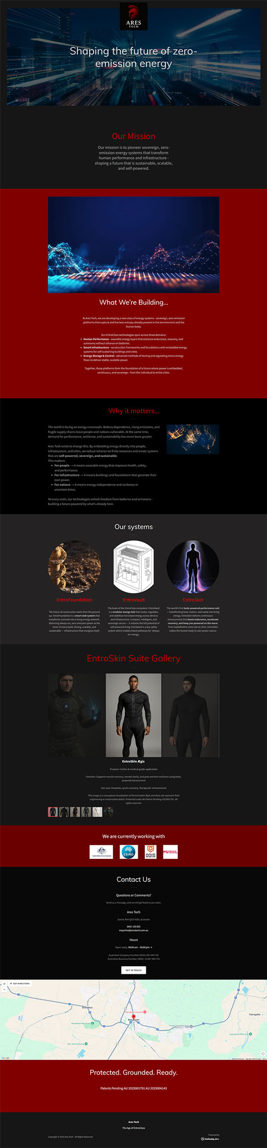
The redesign focused on improving how information is structured and presented to better communicate a bold, emerging technology. While the previous site established a basic structure, it lacked the clarity and refinement needed to convey credibility to a professional audience. Through a more considered layout, more efficient use of content hierarchy, and cleaner organisation of key information, the new design brings Ares Technology’s presence in line with the ambition of the company itself.
Previous Design
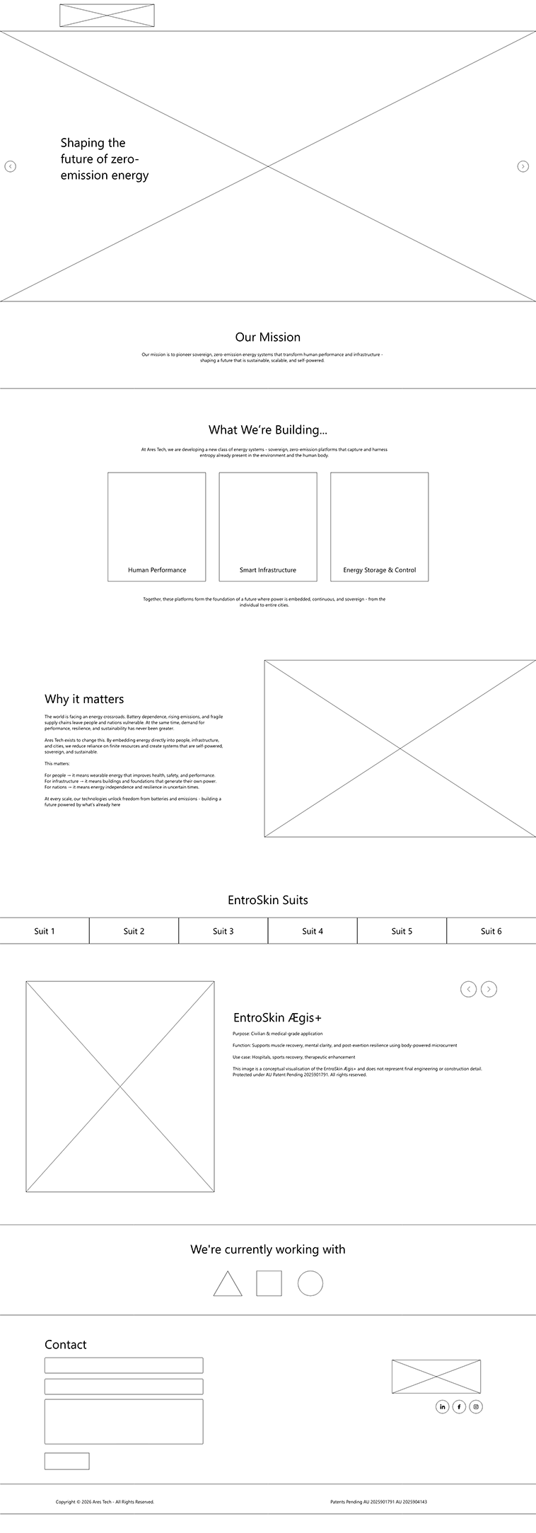
New Wireframe
Identity
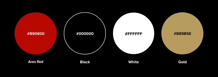
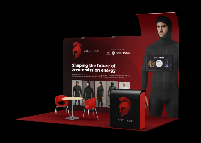
Ares Technology came to the project with an existing AI-generated logo they were attached to, featuring a Corinthian helmet as the mark. Rather than replacing it, the logo was redrawn from scratch to preserve the concept while eliminating the artefacts and inconsistencies that made the original unfit for professional use. The typography was handled with particular care, with a delicate balance required to navigate trademark restrictions. Red was retained as the brand colour at the client’s direction.
To support the complexity of the EntroClass product range, a custom icon set was created to help simplify and communicate each offering clearly. Additional branding opportunities were also explored, including tradeshow stand concepts that extended the identity into physical spaces.
The Finished Design
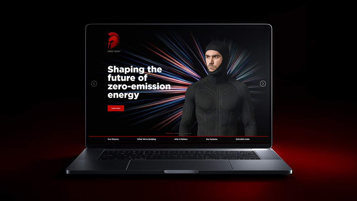
The final design brings together cleaner information architecture and a bold visual language into a cohesive one-page experience. A dramatic full-bleed hero immediately establishes the brand’s scale and ambition, while structured sections guide the user through Ares Technology’s mission, products, and technology platforms in a logical flow. The dark, high-contrast aesthetic anchored in red reinforces the authority and seriousness the brand needed to attract the partners and investors that matter.
Move your mouse over the screen below and scroll to explore the page.